the Hub
Identity, Print & Web CMS
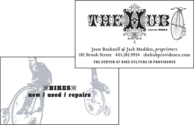
When a rider-owned bike shop in Providence needed a logo, we decided to go against the slick sports look and instead go retro – way retro. An 1880s font insipred this rendition, and the fanciful "H" became iconic for the shop. The sales team at the shop aren't the typical high-sales-pressure gear head, and so, neither is the logo.


