 +The home page design features a customizable "Featured event" and lists upcoming single day and multiday events.
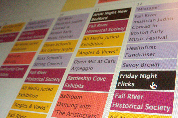 +This is the month view of the events calendar with multiple event types that can have custom colors controlled by the web manager.
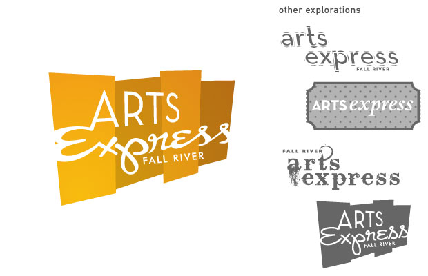 +The logo went through many rounds and ideas what we arrived on speaks to the visual arts, performance, and music.
 +We worked with an illustrator as well as Arts Express on this project. It was a fun process deciding what to put on the map and how to layout the illustration.
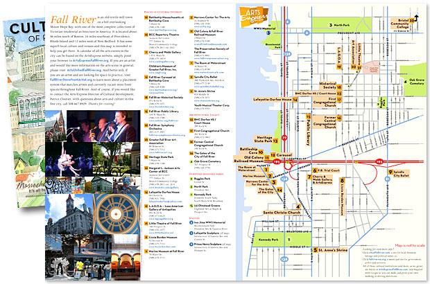 +This side is where all the directions and information was laid out. We love this stuff!
Arts Express
Identity, Print & Web CMS
A new cultural non-profit wanted a fun and vibrant identity. Simple panels suggest curtains or flat artworks, while the color scheme and severe angle also gives an illusion of depth. The type treatment is personal, expressive, but still serious. Our first print peice is a map of the cultural institutions in Fall River, while the website is a city-wide event calendar. Illustration for the map by Scott Camara.