• 1
  • 2
  • cards

the Hub

Identity, Print & Web CMS

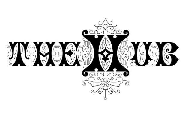
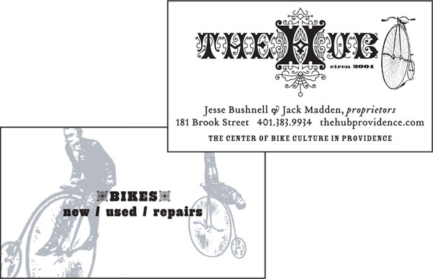
When a rider-owned bike shop in Providence needed a logo, we decided to go against the slick sports look and instead go retro – way retro. An 1880s font insipred this rendition, and the fanciful "H" became iconic for the shop. The sales team at the shop aren't the typical high-sales-pressure gear head, and so, neither is the logo.

« »

Portfolio Categories (if a Category is highlighted, then this Project is in that Category):

Web Print Identity Architects/Builders Portfolio Catalogs/Magazines Collaboration CMS Environmental Signage Illustration Letterpress Non-Profit Institutions Posters/Maps Preservation Pro-Bono Membership Organizations Real Estate Work for Artists

Other Projects for Client

Web / theHubProvidence.com Identity / the Hub