RI Blueways
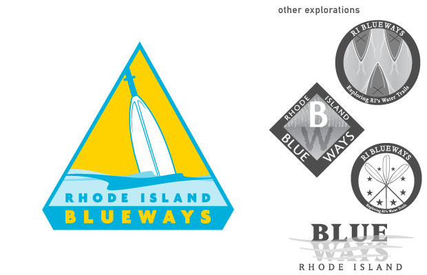
Members of the board of the The Rhode Island Blueways Alliance approached HCd for a new logo design. The mark had to work in print, on the web, and in the wilderness as a trail marker. In the end we worked out an official-looking shape with bright yellow and blue colors which would be highly visible against greenery when in the wild. We went through many iterations of the "oar in the water" idea, and in the end, decided on simple layers of waves, suggesting a gentle river instead of a stormy sea.
